Visualising Data in Digital Cinema Studies: More than Just Going through the Motions?
Deb Verhoeven
The master said You must write what you see.
But what I see does not move me.
The master answered Change what you see.
(Glück 361; emphasis original)It is not possible to apply a method as if it were indifferent or external to the problem it seeks to address, but that method must rather be made specific or relevant to the problem … Inventive methods are ways to introduce answerability into a problem … if methods are to be inventive, they should not leave that problem untouched. (Lury and Wakeford 3)
Introduction
Underlying the empirical turn in the humanities, and then by extension in cinema studies, is a prevalence of data visualisation. [1] Visual interfaces for instance guide us through our various dealings with digital archives. Different visual renderings of very large datasets enable us to navigate swollen oceans of information that would otherwise be unfathomable. Interfaces, tables, graphs, animations are visual forms of classification that also constitute a creative transformation of the information they strive to describe. They pursue their conversations with data evocatively, in the languages of flows, patterns, maps, itineraries and networks. Typically however, the underlying processes driving these visual tropes and forms are “blackboxed”, hidden from the end user. This technical and methodological invisibility has lead to a deficit in our understanding of the very processes by which we simultaneously produce and derive meaning from our data in visual forms.
As cinema studies scholars we are well versed in the particular traumas of visual description. Our aptitude for interrogating the truth of images is a critical and yet largely underutilised one in the area of the digital humanities. When Miriam Posner asks, “Does classical film theory have anything to teach us about digital humanities?” she is particularly exercised by the way narrative theory might be brought to bear on explaining our dealings with databases (187). I want to extend her enquiry to ask how our expertise as analysts of image and sound might also expand our critical repertoire into an assessment of the representations used to deliver and explore data, to ask how visualisations themselves are also constituted as, and contribute to, narratives about data and evidence. This is a particularly relevant challenge for those of us working with digital sources and using digital techniques to extend our studies of the cinema itself. Whereas Lev Manovich has noted the marked alignment of digital media and the cinematic, I want to suggest cinema studies has a powerful and yet largely unrealised role to play in understanding and developing the visualisation techniques that designate and deliver the digital to us. I am painfully aware that many digital cinema studies scholars using data visualisations, myself included, often view them with the kind of uncritical eye that simply wouldn’t be acceptable in our approach to the movies themselves.
The first step in rising to this challenge is to recognise that visualisation is more than a data management or navigation tool. Acts of visualisation reconfigure how we face up to and understand the value of the empirical; they forge a gateway to knowing about the world, of giving data meaning. Data visualisations also produce connections between information, technique, the aesthetic, science and the social. Representations of data and the techniques to produce them are necessarily co-developed alongside our anticipated data requirements. If we accept that visualisation technologies are not simply tools that are independent of what is represented and what we are asking, then we are also implicitly counterposing the idea that somehow data can or should “speak for itself” (see Munster). As Geoffrey Bowker (184) and, more recently, Lisa Gitelman have forcefully pointed out, there is no such thing as “raw” data. It is therefore important to understand how the statistical processes underlying data visualisations are specifically designed to produce the impression of epistemic precision rather than ambiguity, for instance (Drucker, “Humanities”). And it is critical that we consider how the questions addressed by digital cinema studies share and constitute a distinct approach to data and its representation because of the dimensions of the film industry itself. Equally then, what might cinema studies as a discipline share in terms of its approach to data that distinguishes it from the way other scholarly disciplines deal with and define data? I am proposing in response to this question that cinema studies has a unique role to play in opening data visualisation itself to “answerability” rather than only using visualisations to seek answers per se. By answerability I mean both the sense of understanding what accountabilities visualisations might bear (who or what these visualisations are responsible to—scholars, designers, the data, narrative) and also to ask what possibilities they afford for changing the very problems we are specifically addressing (for instance how might a uniquely cinema studies approach to a visualisation alter its “account” of the ampirical and vice versa). Looking to the answerability of visualisations suggests that data, the visual and scholarship each follow imagined narrative trajectories that coalesce in our enquiries. By aiming at the answerability of visualisations we might discover how new developments in digital cinema studies, the film industry itself and data management might provide new or revised dimensions for the way we produce knowledge.
Flow
The Kinomatics Project is a multidisciplinary study that explores, analyses and visualises the industrial geometry of motion pictures (the study of “kinematics” is often referred to as “the geometry of motion”) and is one of the first big data studies of contemporary cultural distribution. Its examination of the movement of films across the globe rests on an archive of showtime information comprising almost 350 million records that describe every film screening in forty-eight countries over a thirty-month period as well as additional aggregated box-office data. The project is almost entirely reliant on the use of visualisations to make sense of its vast data set.
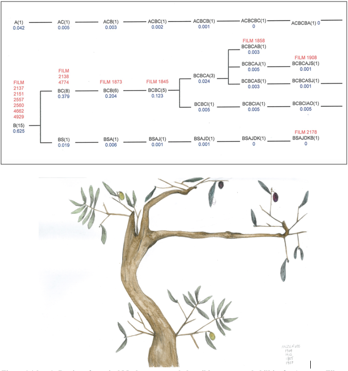
Figure 1 (above): Portion of a typical Markov tree graph describing venue probabilities for Anzervos Films. Colin Arrowsmith, 2011. Figure 2 (below): Olive Tree visualisation of venue probabilities for Anzervos Films launched at the Doncaster cinema. Michelle Mantsio, 2011.
The research team behind Kinomatics includes specialists in film industry studies, information management, network analysis, GIS, geo-visualisation and cultural economics. The Kinomatics Project team members have collaborated on digital film and music industry studies since the late 1990s in different formations. Many of their early data-driven studies of the cinema involved visual experiments that questioned or extended the facility of standard analytic techniques to humanities problems (Arrowsmith, Verhoeven, and Davidson; Arrowsmith and Verhoeven). For example, in using Markov chain visualisations (sometimes known as Markov “trees”) to describe the progression of Greek film titles through an Australian exhibition itinerary, Arrowsmith and Verhoeven recognised that the length of stay in cinemas and the duration of the gap between engagements was not able to be represented using this technique and the resulting analysis was therefore limited (Figure 1). They addressed this deficit by commissioning Michelle Mantsio, an artist who had also worked as a research assistant on the project, to create data visualisations in the form of olive trees that both incorporate the temporal nature of film distribution and which also draw attention to the “constructedness” of the image (Figure 2).
Figure 3 (left): Advertising Slide shown at Greek cinemas in Melbourne during the 1960s.
Figure 4 (right): Aesop’s Tales book cover (Iridanos Publishers, 1968).
Mantsio’s visualisations are scaled watercolours that are able to satisfy the twin demands of successfully representing both the distribution data and olive trees themselves. This was no small feat and involved the creative use of a wide number of visual elements. The data is represented in the form of olive colour (green for Sydney, purple for Melbourne), leaf colour and position (identifying a situated screening in which yellow is QLD, light green is NSW, darker green is VIC, dark brown is SA) and the length of branches (showing the interval of days between screenings at scale). Mantsio used non-data-related pictorial elements such as the thickness and twistedness of the tree trunks or the shape of the leaves to produce a credible depiction of the flora. To further enhance the “readability” of the visualisations she also used tone and a specific colour palette derived from a series of advertising slides shown at the cinemas that were part of the data she was representing (Figure 3) and drawn from her memory of a specific Greek children’s book (Figure 4). For Mantsio, who had attended Greek film screenings in Australia as a child, it was important to represent herself and her own experiences of being a Greek-Australian in the aesthetic she produced. As she says, “I knew how those film screenings felt”.
There were also other creative choices made by Mantsio. Although watercolour painting was not her specific expertise as an artist, she felt this medium really resonated with the underlying data spreadsheets and their palpable sense of flow and interrelatedness. This format also afforded her more control over the construction and combination of the visual variables and could be executed in a reasonably time-efficient manner without forfeiting the care required to produce each illustration. A previous experiment in the use of collages for example simply took too long. Through this appreciation of the sheer duration of the visualisation process, as well as the nod to her personal childhood memories, Mantsio introduced nuanced layers of temporality to the visualisations, well beyond our initial brief which had simply focused on depicting the interval between screenings.
Similarly, Alwyn Davidson, using data from the Cinema and Audiences Research project (CAARP) database (the same one used by Mantsio), developed a unique visualisation format to accommodate multi-variate information in one view (Davidson, Verhoeven, and Arrowmsith). Davidson’s aim was to develop a visualisation of post-war film exhibition in Melbourne that could consider space, time and cinema venues without compromising the changeable temporality of the film industry during a period of intense commercial volatility in which a substantial number of cinemas closed. Her focus was on producing a visualisation that considered the dynamic and distinct nature of cinema data and the specific research questions it prompted. By combining a complex array of spatiotemporal data of different kinds into one visualisation, Davidson effectively brings to the surface the deliberative qualities of the data and the interpretive nature of data visualisation.
Looking closely at the data, Davidson determined that although the spatial location of the cinema was important, street address or specific geographic coordinates were not. Instead it was the cinema’s distance and direction from the city centre that was the most influential factor in its fate. Also important were business decisions about the cinema’s operations such as changes to seating capacity or number of screens. The result was the creation of “Petal” visualisations which present a framework of cardinal axes along which various events in the life (and death) of a cinema occur and which are depicted in terms of visual variables such as colour, line style and line width (Figure 5). These can be applied to different types of information to compare the relationships between various attributes to determine how important a factor was the company ownership in the sustainability of cinemas for example.
Davidson’s Petal diagrams are a provocative use of visualisation techniques, designed to prompt further analysis and interpretation. They invite the cinema historian to reflect on overlapping historical circumstances, bringing various temporal patterns into adjacency for the purpose of comparison and evaluation. Davidson’s approach explicitly recognises that precise geo-location is not always the most relevant spatial attribute for analysing cinema performance, an insight that is especially important when the underlying street address data is imprecise or ambiguous. The detail of this work also prompts us to consider the capacity of visualisations themselves for opening up a range of data sources to better address the complexity and heterogeneity of humanities data.
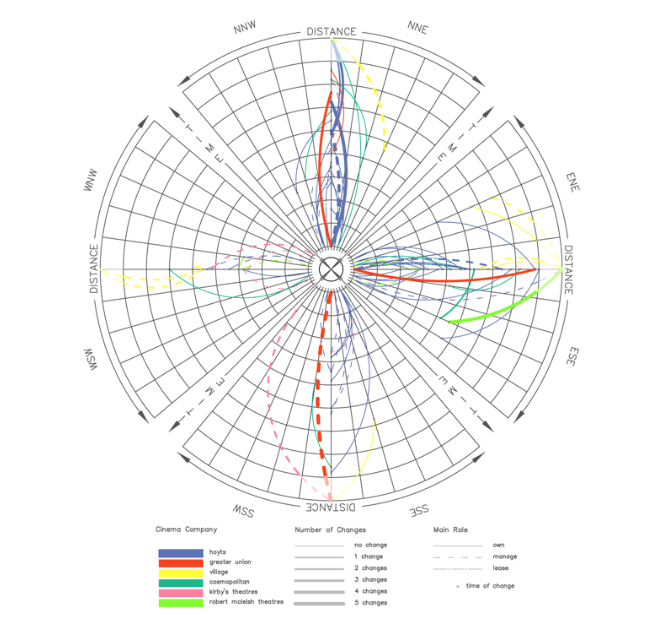
Figure 5: Petal diagram visualising the openings and closing of cinemas in Melbourne between 1950 and 1970. Alwyn Davidson, 2011.
Scale
Conceptually, Davidson’s project continues on from the new cinema history’s suggestion that the cinema is not a sequestered set of practices but is made up of contingent, overlapping, social and business networks. This framework also informs the Kinomatics Project, which has drawn heavily on geo-visualisation, animation and social network analysis (SNA) visualisations to understand and examine its monumentally detailed dataset.
The Kinomatics Project is based on the premise that we can analyse films as unique cultural goods that move across the globe and specifically between “territories” or national markets. Analysing films in this way enables us to consider the detailed movements of movies as tradable commodities but it also invites reflection on our use of the very large datasets that describe these exchanges and locations. For example, understanding the dynamics of global film exhibition and distribution involves an appreciation of visual and narrative tropes in both the film industry (such as the global motility of certain genres) and in a data-driven approach to its study.
In a sense the Kinomatics data requires a multi-scaled approach to analysis. Exhibition and distribution of film titles is typically defined at a range of levels; an individual cinema, at a regional (“territorial”) level, through national regulatory practices, and internationally. The Kinomatics data is also able to be “scaled” in composite ways, so we can aggregate information to give insights into the international impact of micro-attributes such as the role of individual stars in the success or failure of films or the impact of awards ceremonies on global release patterns at the theatre level. Looking at cinema exhibition and distribution at an international scale requires us to see the data as more than broad aggregates, it requires us to also be able to “see” data that is specific to individual films and cinema venues in order to appreciate the intricate temporal and geographic aspects of flow, saturation and other patterns.
In addition to using visualisations to understand industry practices, we have also used them to evaluate the data itself. Visualisations in Kinomatics are developed to test the validity of the data (determining through geo-visualisation where venues have been incorrectly positioned for instance), to measure the data (to determine where significant amounts of data are missing), and to reflect on our own assumptions about the data (using network visualisations to identify previously overlooked trade relationships) in the way Laura Mandell suggests when she describes visualisation as a way of “amplifying cognition”. Similarly, cartographers Sebastien Caquard and William Cartwright describe the importance of critically appraising the visualisation process itself as a way to extend the value of their work mapping cinema circuits:
Although the potential of maps to tell stories has already been widely acknowledged, we emphasize the increasing recognition of the importance of developing narratives that critically describe the cartographic process and context in which maps unfold—the core idea of post-representational cartography. (105)
What is at stake here is the question of how aesthetic, cultural and conceptual patterns are produced at the same time as the computational techniques which generate our visualisations. How, as digital cinema studies scholars, might we better reveal these processes, how might we materialise them as processes within our visualisations, so that the packaging of scientifically framed or “objective” imagery is instead read as images that are contestable and interpretable. These considerations have become especially apparent with the advent of big data and the proliferation of technologies that have accompanied it. The various representational modalities that typify globally scaled, big data visualisations of “the world” for instance can be seen as both a mechanism of, but also producing a version of, universalisation. How might we politicise these images of the “global”, not as a critical after-effect but as an integral part of the way we deploy technologies for visualising big data. These are questions we are confronting in the Kinomatics big cinema data project.
An Unexpected JourneyBeginning in 2012, with support from a major research grant, we were able to amass our data collection of cinema show times in time to capture the release of The Hobbit: An Unexpected Journey (Peter Jackson, 2012) and we continued to collect data that covered the release of the subsequent Hobbit sequels. [2] The Hobbit trilogy was rather unusual in that each film was released in early December instead of on the traditional Boxing Day launch for Hollywood blockbusters. This had an immediate impact on our work. Firstly it shifted the temporal basis for our analysis from the conventional calendar driven annual unit of comparison (January–December). Instead, we used a “Hobbit year” running from December–November (Davidson and Verhoeven). The sheer volume and global scope of screenings also required visualisations to measure and evaluate the data. Initially we attempted to get to a level of analysis of The Hobbit’s circulation that moved beyond the immediately obvious. Various visual presentations were made of the Hobbit data against spatial (Figure 6), temporal (Figure 7) and technical infrastructure (Figure 8). But in reality, we had framed our question conventionally, as if we were approaching the task from a small data perspective. As it transpires, there is little point in looking for a “flow” in the circulation of The Hobbit. Contemporary day and date releasing and the availability of massive global data say otherwise. The Hobbit does not flow. It waxes and then wanes. This is a haemorrhage of Hobbits. These films saturate the world. We are soaking in them. The “situatedness” of this cinema data might still be described pointedly, in pinned positions, but is also available to us in newly revised relations of time, space and volume.
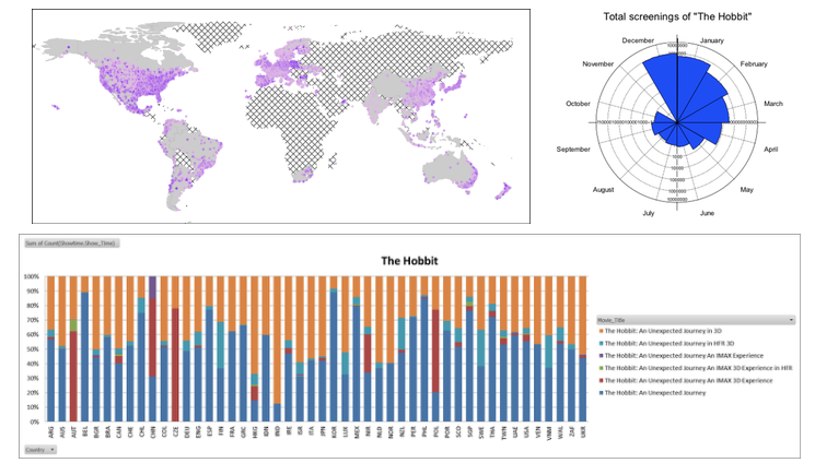
Figure 6 (top left): Screenings of The Hobbit: An Unexpected Journey (Peter Jackson, 2012). Hatched areas have no data. Alwyn Davidson, 2014. Figure 7 (top right): Rose diagram of total number of screenings of The Hobbit: An Unexpected Journey for forty-eight countries. Logarithmic scale used. Colin Arrowsmith, 2014. Figure 8 (bottom): Percentage of different release formats for The Hobbit: An Unexpected Journey by country. Alwyn Davidson, 2013.
As a result of our frustration with these early visualisations of The Hobbit data, we decided to make use of network visualisations to arrive at a more nuanced picture of cinema trade exchanges. Rather than seeking confirmation of what we already knew, that The Hobbit was very widely released, we decided to look for other stories in the data. We were particularly interested in narratives of reciprocal exchange between countries, in which there is a more equitable trade of films rather than the unilateral domination of one film or film industry across the globe. To get to these aspects of the data we generated network visualisations to illustrate the operation of a dyadic approach which emphasises reciprocity as a key feature that drives film exchange relations. Stuart Palmer was able to generate a variety of images to assist us in analysing the value of this approach to the data. Figure 9 is a Gephi visualisation that uses the Openord layout algorithm. The node sizes describe the average cinema reciprocity of a country, so the larger the node, the more equal the transfers of film in and out of a country.
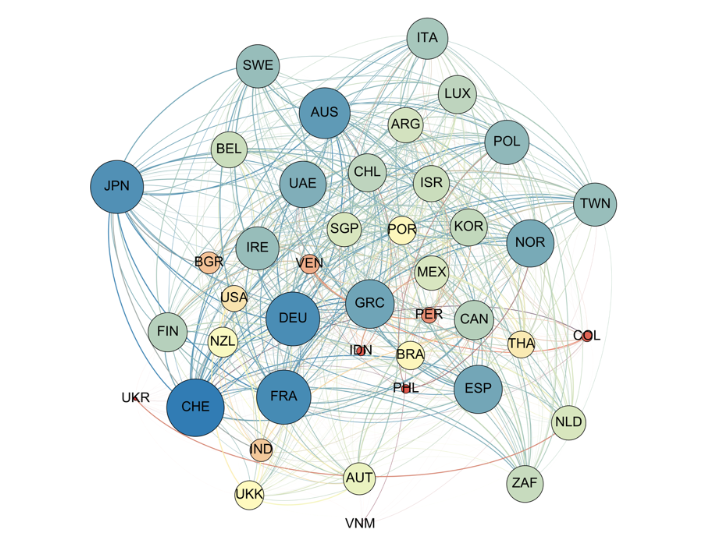
Figure 9: The reciprocal exchanges of films expressed in terms of screenings of new release feature films. Stuart Palmer, 2016.
These visualisations are a first tentative step in extending our visualisation repertoire to improve our ability to work with the complexity of our data. They are prompted by our recognition that we need to better acknowledge and address power in film trade networks. And conversely, how we might recognise and imagine within the data alternative worlds without domination. Worlds of coexistence for instance. These are challenges that are equally technical, political and philosophical. And visual.
But, despite our best intentions, in all honesty, we haven’t yet really risen to fully meet Johanna Drucker’s visualisation challenge: “Can we augment the impoverished graphic and conceptual vocabulary and syntax in current visualisations and make them more suited to humanities work?” (“Graphic Provocations”). For Drucker, “every single visualisation being used in the digital humanities is visually impoverished, conceptually corrupted and intellectually inadequate to the tasks of humanistic work” (“Graphic Provocations”). Data visualisations seldom show the full ambiguity, heterogeneity and contradiction of cinema data, for example. Typically, they do little to emphasise and enable interpretation and rely instead on collapsing the distinction between their representational qualities and the evidence they portray. Many of our data visualisations have attempted in one way or another to improve on the visualisation tools at our disposal, to emphasise their graphic qualities, adjust their representational capacities and to provoke interpretation. We are currently looking at different visualisation types including large-scale interactive animations as a way of further exploring the epistemological and hermeneutical dimensions of different methods. But there is so much more to do. In our experience, for example, big data demands a revised, perceptually dynamic approach to representation, capable of transforming the temporality, spatiality and scale of previous relationships with and between data and more broadly with the empirical. Big data requires we try to see things from more than one vantage by adopting something similar to a plenoptic view, which would capture the direction and intensity of data in any given space and with the ability to select which part of the image is in focus at any given time.
Conclusion: Intellectual Itineraries
Research papers tracing the trajectory of a project generally propose teleological histories, carefully argued accounts that are retrospectively driven by a continuous logic that leads progressively to a concluding success of some kind and which rarely reflects on the conflicting or serendipitous paths, the tedious duration, the laborious and sometimes pointless processes, or the underlying untidiness of what we do and how we do it. If this is the perceived intellectual itinerary of this article, then I have done the Kinomatics Project and our research a disservice.
The progressive scholarly expeditions described so frequently in our discipline are further reiterated by the case study nature of so much digital cinema studies research, which implicitly suggests that our tools and our methods are transferable from one context to another without themselves, or the answers they enable, or the broader “answerability” of our work (in terms of its openness to itself being questioned), being altered in any way. Indeed it is really our mobility, our movement through space and time that we are describing in these writings. More generally, we are suggesting the idea that we ourselves move forwards, accelerating, one project at a time, towards more capacious forms of knowing. Perhaps the defining emphasis on case-study-driven research in conventional cinema studies might also be linked to the increasingly ad hoc nature of contemporary academic enterprise which itself leans on permutations of piecemeal technical, intellectual, interpretive, social, administrative and logistical routines. And it would be prescient to acknowledge that big data projects such as Kinomatics could not proceed without significant research funding and that they are therefore not readily possible for many researchers—which gestures towards a new form of “digital divide” in current cinema scholarship.
Up to this point in my argument, visualisations have served as a metonymy for a belief in the figurability of the world. They suggest that the problems we are trying to address in the contemporary film industry are primarily representational ones. And consequently they suggest that our own forms of disciplinary practice in cinema studies might also be traced in terms of different forms of perception and envisioning. Distinctions between close (micro-analytical) and distant (macro-analytical) readings, for instance, would be a recent example of this idea of intellectual perception. In these accounts, we stand outside our data, are not implicated by it and nor do our “perspectives” or “positions” change it. We imagine that we are spatially segregated from our work and that we address the “evidence” frontally. In some ways this is not unlike our approach to cinemagoing itself; we can choose to occupy the front row and immerse ourselves in close proximity to the films themselves or we can move back for greater context. For many digital cinema studies scholars then, our data simply precedes us, we just need to find the sweet spot in the stalls all the better to see it and on finding our seat, the data, which is produced elsewhere, will yield up its stories to us (as if it speaks for itself) and we only need to look within ourselves in order to appreciate and perhaps even applaud it.
These distinctions, however, do little to address the perspectival and perceptual demands of big cinema data. Evaluating this data requires us to work collaboratively, across many disciplines even if this decentres our outlook as cinema scholars at some level. Working critically with big cinema data is not simply a matter of addressing our own disorientation by moving closer or further from the evidence, as if less or more distance could be measured as a deviation or orientation to scholarly subjectivity. Instead, we need to realise a better understanding of our own generative and overlapping spaces as researchers; with each other, with the data itself and with the tools we adopt and adapt. The Kinomatics Project reveals how global or big data is always partial, not so much because it is incomplete, but because we approach it through the contingencies of our own coexistences—as an entanglement between what we do and what is done to us.
Acknowledgments
The author would like to acknowledge members of the Kinomatics research team who contributed to the work on which this article is based: Colin Arrowsmith, Bronwyn Coate, Alwyn Davidson, Michelle Mantsio, and Stuart Palmer.
Notes
The “new cinema history” has been a fertile area for the consideration of the empirical in cinema studies (see Allen; Maltby).
Australian Research Council grant, DP120101940.
References
1. Aesop. Αισώπειοι-Μύθοι. Trans. Stratis Tsirkas. Athens: Iridanos Publishers, 1968. Print.
2. Allen, Richard. “Relocating American Film History: The ‘Problem’ of the Empirical”. Cultural Studies 20.1 (2006): 48–88. Print.
3. Arrowsmith, Colin, Deb Verhoeven, and Alwyn Davidson. “Exhibiting the Exhibitors: Spatial Visualization for Heterogeneous Cinema Venue Data.” The Cartographic Journal 51.3 (2014): 301–12. Print.
4. Arrowsmith, Colin, and Deb Verhoeven. “Visual Methods for Showing Cinema Circuits at Varying Temporal and Spatial Scales.” Proceedings of the 2011 Geospatial Science Research Symposium. Eds. Colin Arrowsmith, Chris Bellman, William Cartwright, Simon Jones, and Mark Shortis. Melbourne: Australia, 2011. 1–15. Print.
5. Bowker, Geoffrey. Memory Practices in the Sciences. Cambridge, MA: MIT Press, 2005. Print.
6. Caquard, Sébastien, and William Cartwright. “Narrative Cartography: From Mapping Stories to the Narrative of Maps and Mapping.” The Cartographic Journal 51.2 (2014). 101–6. Print.
7. Davidson, Alwyn, and Deb Verhoeven. “Bad Hobbits Die Hard: How to Make a Better Top 10 Movie List.” The Conversation. 11 Dec. 2014. Web. 22 June 2016. <https:// theconversation.com/bad-hobbits-die-hard-how-to-make-a-better-top-10-movie-list-3524 7>.
8. Davidson, Alwyn, Deb Verhoeven, and Colin Arrowmsith. “Petal Diagrams: A New Technique for Mapping Historical Change in the Film Industry.” International Journal of Humanities and Arts Computing 9.2 (2015): 142–63. Print.
9. Drucker, Johanna. “Graphic Provocations: What Do Digital Humanists Want from Visualization?” The second Susan Hockey Lecture in Digital Humanities. 25 May 2016. Web. 22 June 2016. <https://www.ucl.ac.uk/dh/events/SusanHockeyLecture/2016>.
10. ---. “Humanities Approaches to Graphical Display.” Digital Humanities Quarterly 5.1 (2011). Web. 22 June 2016. <http://www.digitalhumanities.org/dhq/vol/5/1/000091/000091. html>.
11. Gitelman, Lisa, ed. “Raw Data” Is an Oxymoron. Cambridge, MA: MIT Press, 2013. Print.
12. Glück, Louise. Poems 1962–2012. New York: Farrar, Strauss and Giroux, 2012. Print.
13. The Hobbit: An Unexpected Journey.Dir. Peter Jackson. New Line Cinema, 2012. Film.
14. “Kinomatics: The Industrial Geometry of Culture.” Project website. Web. 22 June 2016. <http:// kinomatics.com>.
15. Lury, Celia, and Nina Wakeford. “Introduction: A Perpetual Inventory.” Inventive Methods: The Happening of the Social. Eds. Celia Lury and Nina Wakeford. London: Routledge, 2012. 1–24. Print.
16. Maltby, Richard. “New Cinema Histories.” Explorations in New Cinema History: Approaches and Case Studies. Eds. Richard Maltby, Daniel Biltereyst, and Philippe Meers. 3–40. Oxford: Wiley-Blackwell, 2011. Print.
17. Mandell, Laura. “The Digital in the Humanities: An Interview with Laura Mandell: Melissa Dinsman interviews Laura Mandell.” LA Review of Books. 24 Apr. 2016. Web. 22 June 2016. <https://lareviewofbooks.org/article/digital-humanities-interview-laura-mandell/>.
18. Manovich, Lev. The Language of New Media. Cambridge, MA: MIT Press, 2001. Print.
19. Munster, Anna. An Aesthesia of Networks: Conjunctive Experience in Art and Technology. Cambridge, MA: MIT Press, 2013. Print.
20. Posner, Miriam. “How Is a Digital Project Like a Film?” The Arclight Guidebook to Media History and Digital Humanities. Eds. Charles R. Acland and Eric Hoyt. University of Sussex: REFRAME Books, 2016. 184–94. PDF e-book. <http://projectarclight.org/ book/>.
Suggested Citation
Verhoeven, D. (2016) 'Visualising data in digital cinema studies: more than just going through the motions?', Alphaville: Journal of Film and Screen Media, 11, pp. 92–104. https://doi.org/10.33178/alpha.11.06.
Deb Verhoeven is Professor and Chair of Media and Communication at Deakin University. She is the Project Director of Kinomatics.


